 Signin


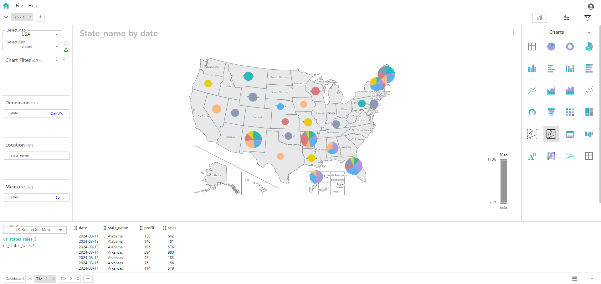
Bubble Map
A bubble map combines the features of a geographical map with bubble charts to display data across different locations. It uses bubbles of varying sizes and colors to represent the magnitude of a measure within different geographical areas and dimensions.
Key Fields of a Bubble Map
- Represents the categorical variable used to define different groups or categories within the location. The dimension helps differentiate the data points on the map. Categories within the dimension are used to segment or group data across the map. It adds another layer of categorization to the map, often shown through bubble colors or labels.
- Product Category
- Defines the geographical context in which the data is plotted. This field determines the base map and the geographical areas where the bubbles are placed. The location field organizes the map into different regions or areas (e.g., countries, states, cities) where bubbles will be plotted. It represents the geographical boundaries within which the dimension and measure are analyzed.
- Geographical Areas
- Represents the quantitative value associated with each bubble on the map. The measure is visualized through the size of the bubbles and sometimes their color. The size of each bubble corresponds to the value of the measure for that specific location and dimension. Provides insight into the magnitude or performance metric within each geographical area and dimension.
- Sales Revenue
You can display a maximum of One Dimension, One Location and One Measure in your chart/table.
When to Use a Bubble Map:
- Useful for visualizing how a specific measure varies across different locations and categories within a location.
- Helps in comparing quantitative values across different areas or categories within the specified location.
- Effective for visualizing and comparing performance metrics (like sales revenue) across different geographical areas and dimensions.