 Signin


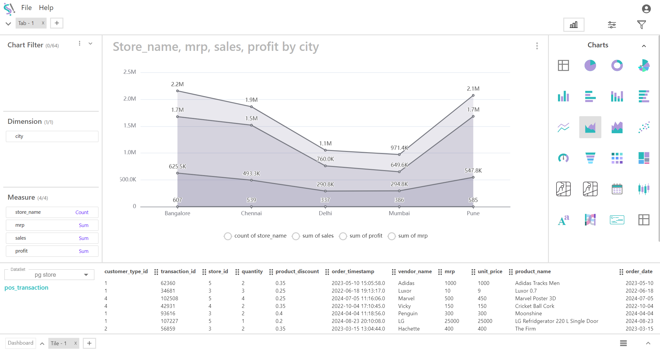
Area Chart
An area chart is a type of graph that displays quantitative data over time or another continuous variable, where the area beneath the line is filled with color. It is used to show the magnitude of values and to illustrate changes in the data over time or across categories. Here’s a detailed overview of area charts:
Key Fields of a Area Chart
- Dimensions are qualitative or categorical data that describe or segment your data.
- Shows the main categories being analyzed, such as different cities, regions, time periods, or product types.
- Time-Based Dimensions: Date, month, year.
- Categorical Dimensions: Product category, customer segment, department.
- Geographical Dimensions: Country, state, city.
- Measures are quantitative data that represent numerical values and can be aggregated. They are used to provide metrics or calculations in your visualizations.
- Typically consist of numbers that can be aggregated or summarized.
- Aggregating, calculating, and creating the Y-axis in charts. Measures provide the values that are visualized.
- Sales Figures: Total sales, sales revenue.
- Quantities: Number of units sold, inventory levels.
- Financial Metrics: Profit margins, expenses.
You can display a maximum of One Dimension and Four Measures in your chart/table.