 Signin


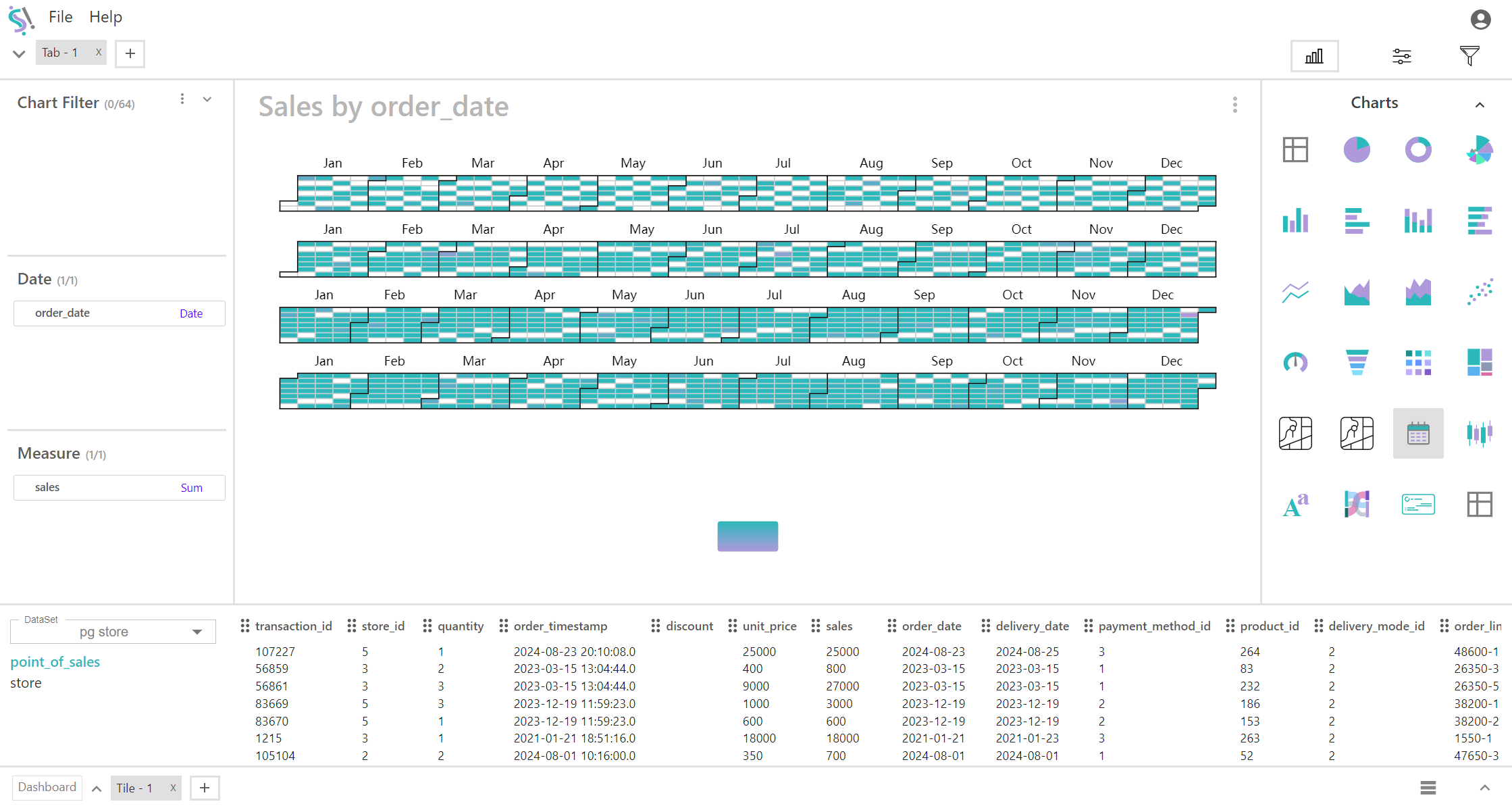
Calendar Chart
A calendar chart is a type of visualization that displays data across a calendar format. It helps to visualize patterns and trends over time, especially focusing on daily data. Calendar charts are useful for identifying seasonal trends, activity patterns, and variations over days, weeks, or months.
Key Fields of a Calendar Chart
- Represents the specific day or range of days being visualized in the calendar format. Provides the time dimension for the chart, organizing data by day, week, or month.
- Specific Date, month, quarter, or year
- Represents the numerical value or metric associated with each date. Quantifies the data displayed for each day, which is visualized through color intensity or numerical values within the calendar cells.
- Measure Value: Daily Sales Revenue
You can display a maximum of One Field Date and One Measure in your chart/table.
When to Use a Calendar Chart:
- Ideal for visualizing and analyzing data that is recorded on a daily basis, such as sales revenue, website traffic, or daily temperatures.
- Useful for identifying trends, patterns, and anomalies over time, such as seasonal variations or unusual spikes in activity.
- Effective for tracking performance metrics across days and spotting days with exceptional values or irregularities.