 Signin


Sankey Chart
A Sankey chart is a type of flow diagram used to visualize the distribution and flow of data between different categories or stages. It uses arrows (or flows) whose widths are proportional to the values they represent. Sankey charts are particularly useful for displaying how values move between categories or stages, and they can help in understanding relationships and proportions between different elements.
Key Fields of a Sankey Chart
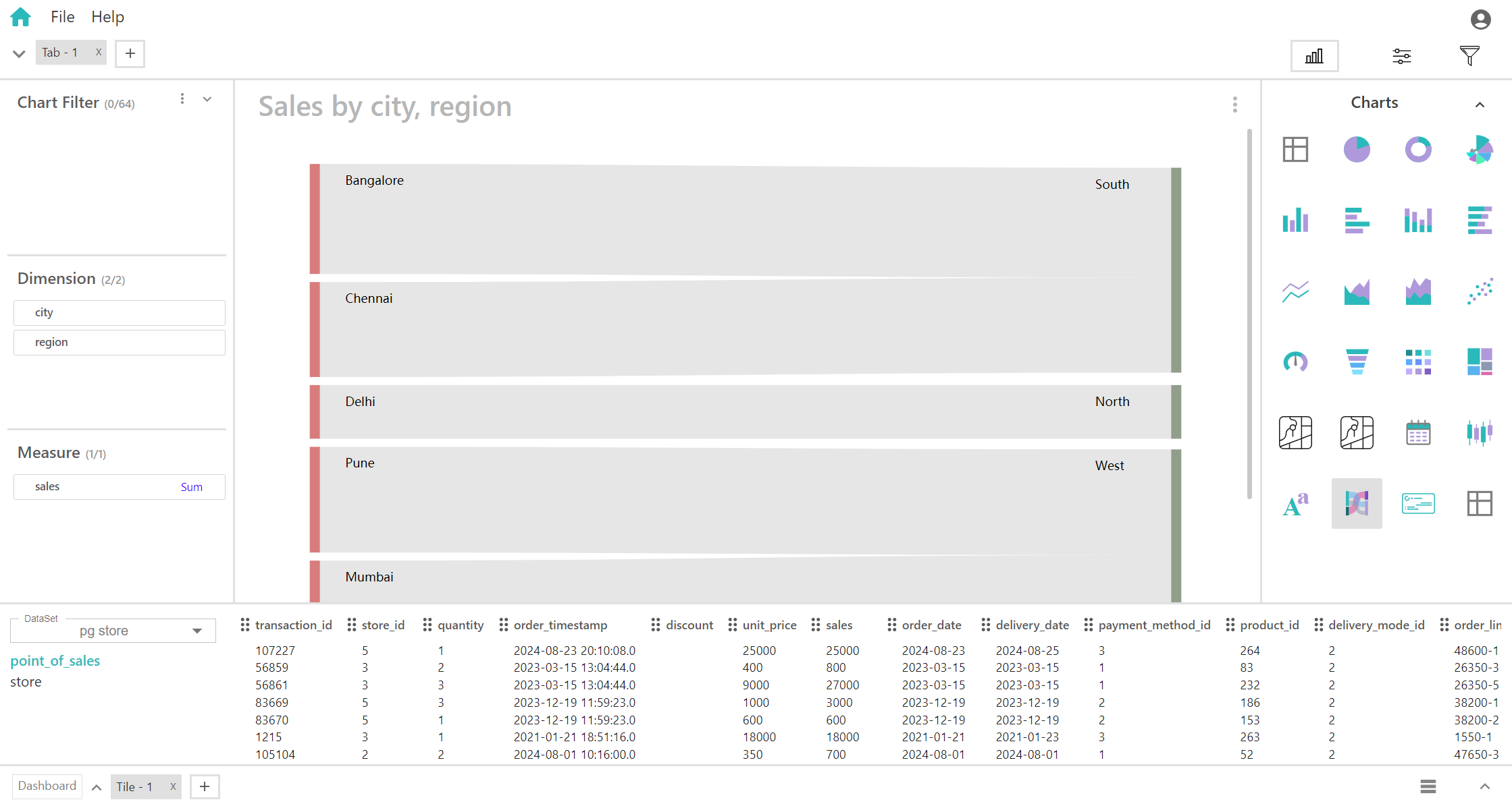
- Represent the categories or stages at both ends of the flow. One set of dimensions defines the sources or starting points, while the other set defines the destinations or end points. Dimensions are placed on either side of the chart. The sources are usually on one side (left), and the destinations are on the other side (right). These dimensions define where the measure originates and where it flows to. They are used to create the connections or flows between the categories.
- Source Dimension: Sales Region
- Destination Dimension: Product Category (e.g., Electronics, Clothing, Furniture)
- Represents the quantitative value that flows between the categories defined by Dimension 1 and 2. The measure determines the width of the flows in the Sankey chart. Provides insight into the size of the flows and helps visualize the distribution and proportions of the measure across different categories.
- Measure: Sales Revenue
You can display a maximum of Two Dimensions and One Measure in your chart/table.
When to Use a Sankey Chart:
- Ideal for visualizing how a quantitative measure is distributed between different categories or stages.
- Useful for understanding the proportion and magnitude of values moving between various categories.
- Effective for tracking and analyzing processes or systems where the flow of data or values is important.